A festival of underground creative works.
The B-Side is a collective organised by Photography and Creative Events Management students at Falmouth University. It aims to provide a platform for creatives to display and share their work, as well as network and build an audience. I oversaw their visual identity in the leadup to their first major event, an eponymous creative festival.
The most substantial part of the identity is the typography: a combination of Eurostile Extended and Linotype Americana, two distinctly contrasting typefaces, represent two ends of a broad stylistic spectrum. This contrast makes the diversity of B-Side’s exhibited work seem more intentional than simply trying to fit it all into a grid with Helvetica.
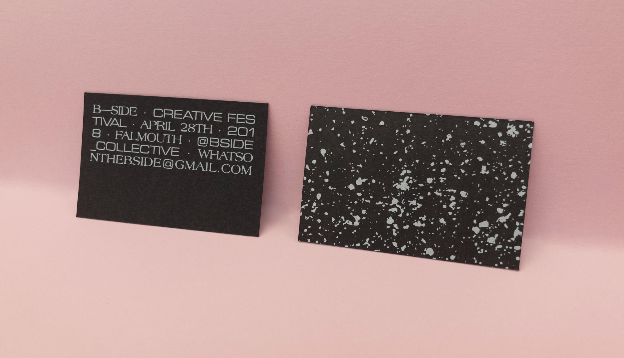
B-Side’s combination business card/flyers were printed onto 300gsm black card stock with white ink. The speckle pattern, used elsewhere as a background texture and brand element, is unique on every card.
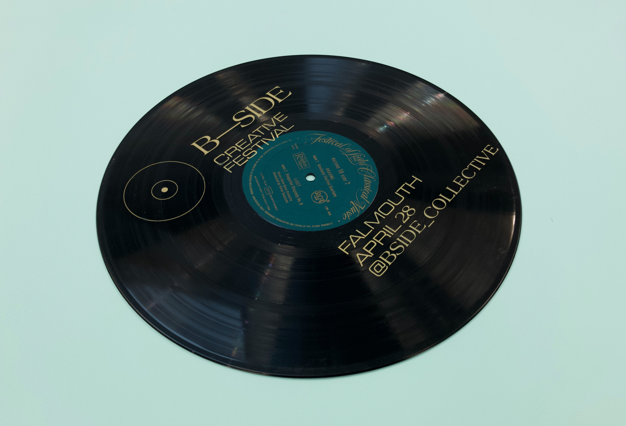
The festival’s advertising relied on a number of posters — old vinyl records, the b-sides of which were screen printed with B-Side’s details. Most of these were almost immediately stolen, which I have taken as a compliment.
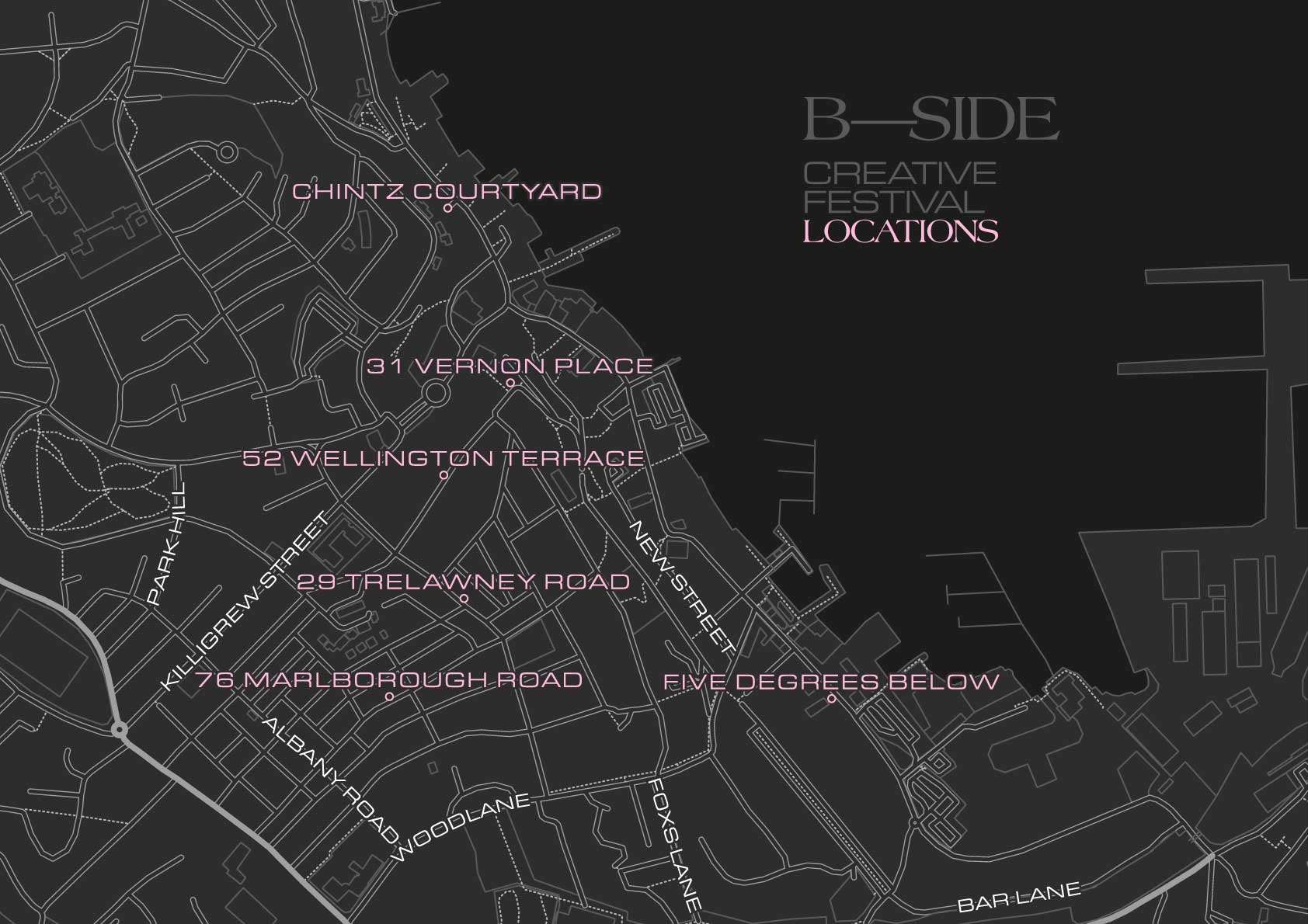
The B-Side Festival took place in five locations simultaneously, with an after-party at a sixth. I used public GIS data from OpenStreetMap to create an accurate, scalable vector map to direct attendees to the various sites.