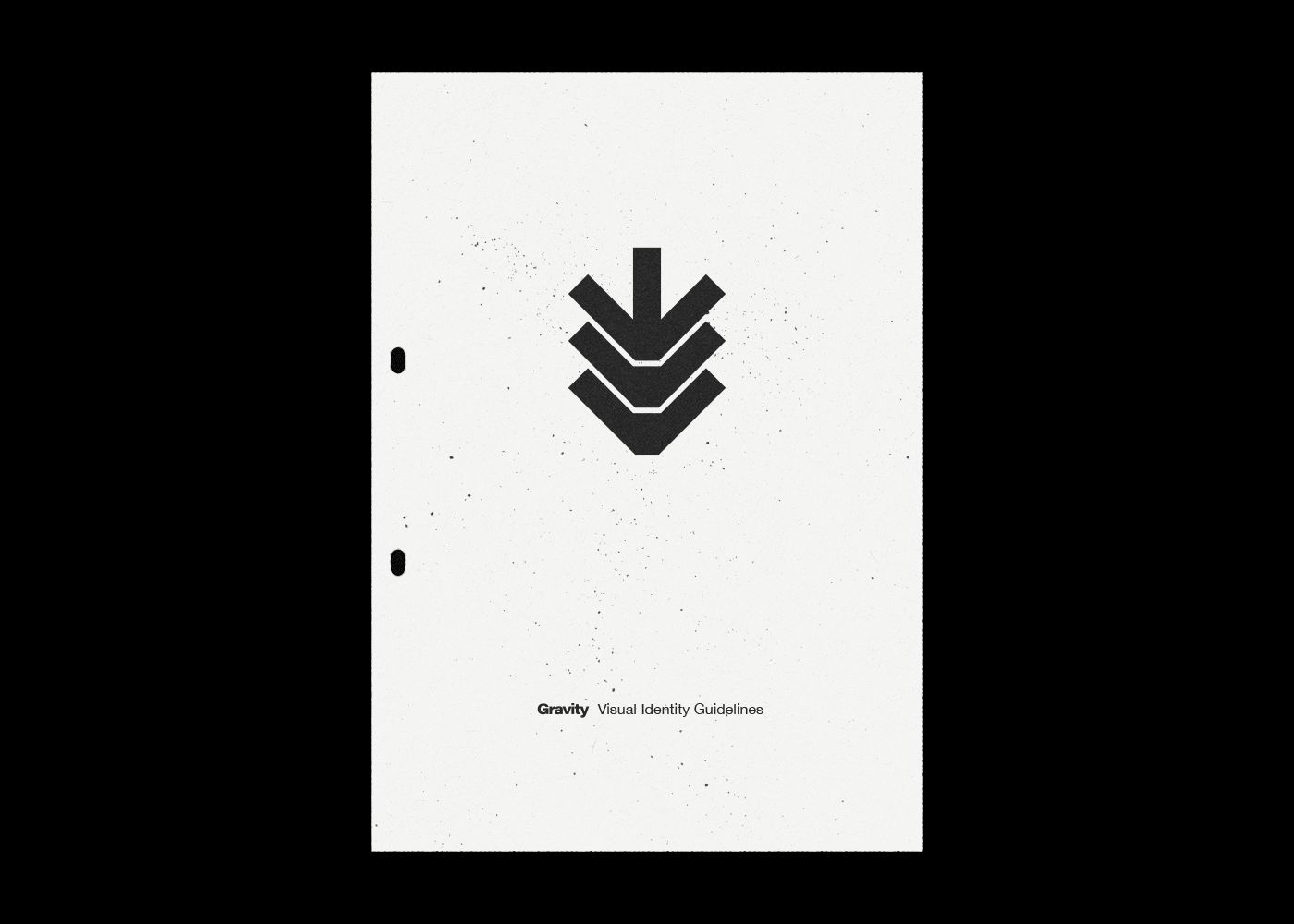
Gravity is an amateur eSports team set up by a friend of mine. I provided the logomark and branding for the team as a pet project, drawing on the bold, instantly-memorable shapes of The Designers Republic for the wipEout series in particular. The mark attempts to be both futuristic and nostalgic, striking a balance which can resonate uniquely with the gaming community.
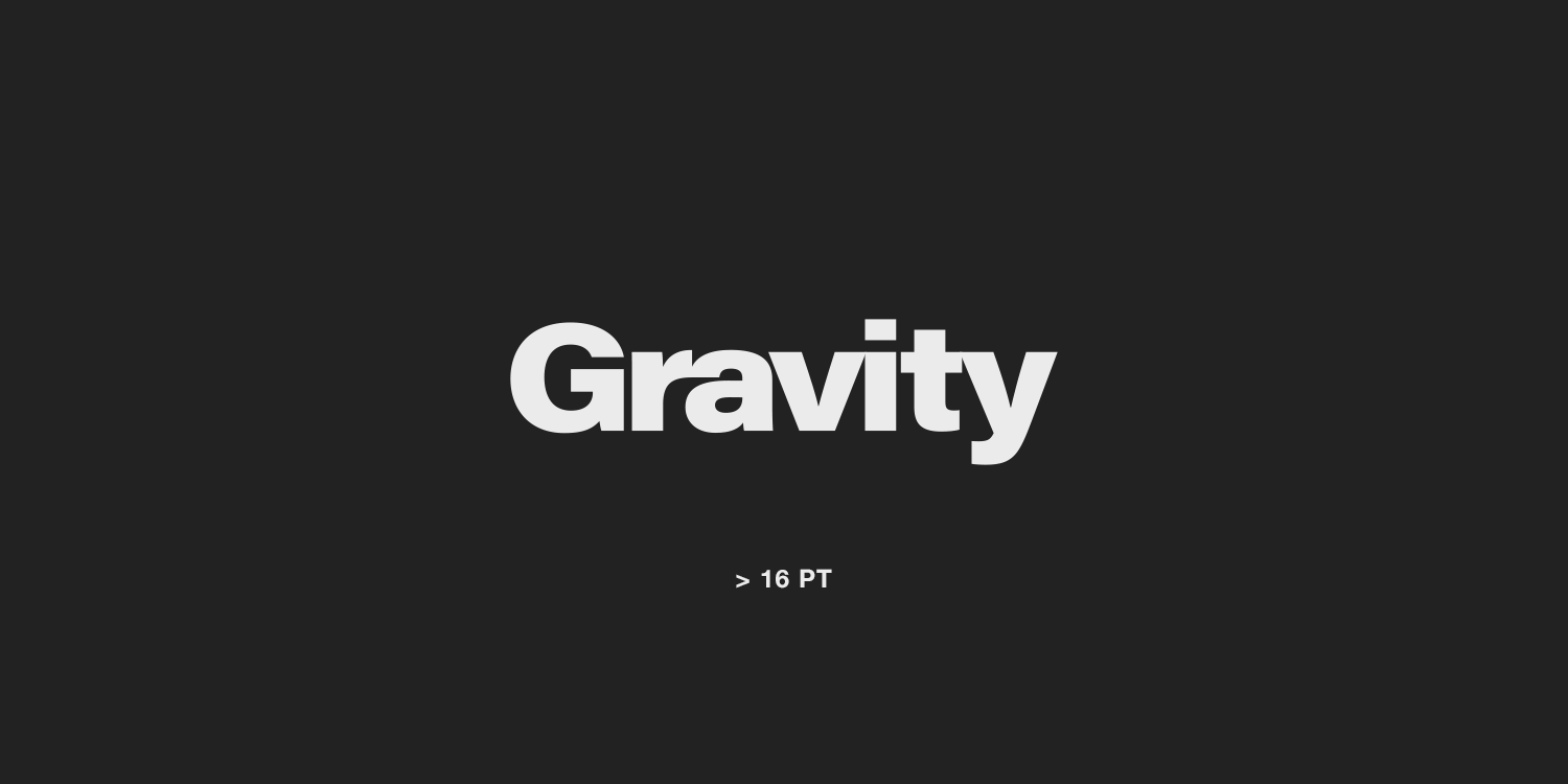
Custom-modified lettering helps unify and optimise the wordmark — I used a font with variable weight to find the specific boldness which most closely harmonised with the logomark, then manually spaced the letters and modified them to fit.
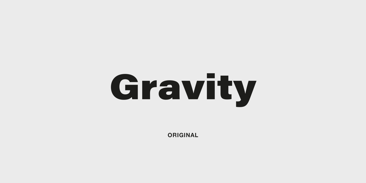
I produced two versions of the logo, at two different optical sizes: a tight-fitting, high-contrast mark is bold and dramatic, while a looser version with more open negative spaces keeps readability high at small sizes.
I also made a set of brand guidelines, to serve as a reference for future work. It provides references for typography (which uses macOS system fonts to avoid licensing issues for such a low-budget project), along with information on when to use the different optical sizes, and the guidelines themselves are an example of how a Gravity-branded document would be arranged.