A workhorse serif for editorial design.
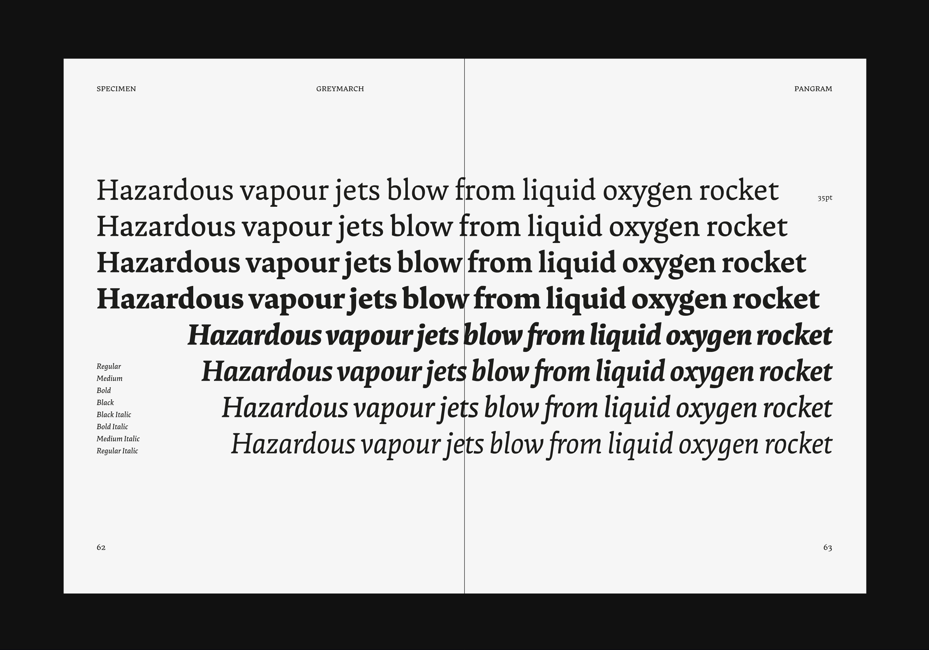
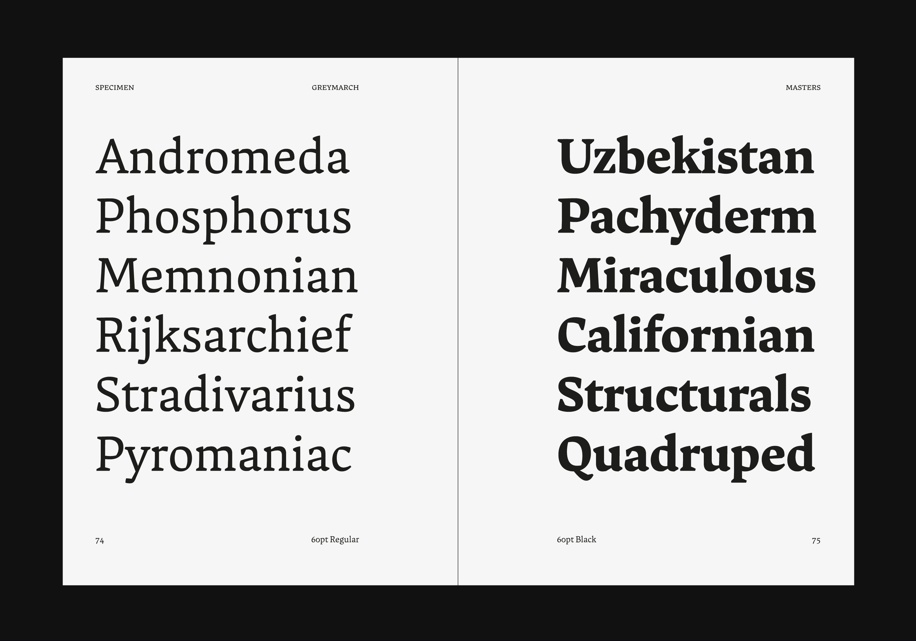
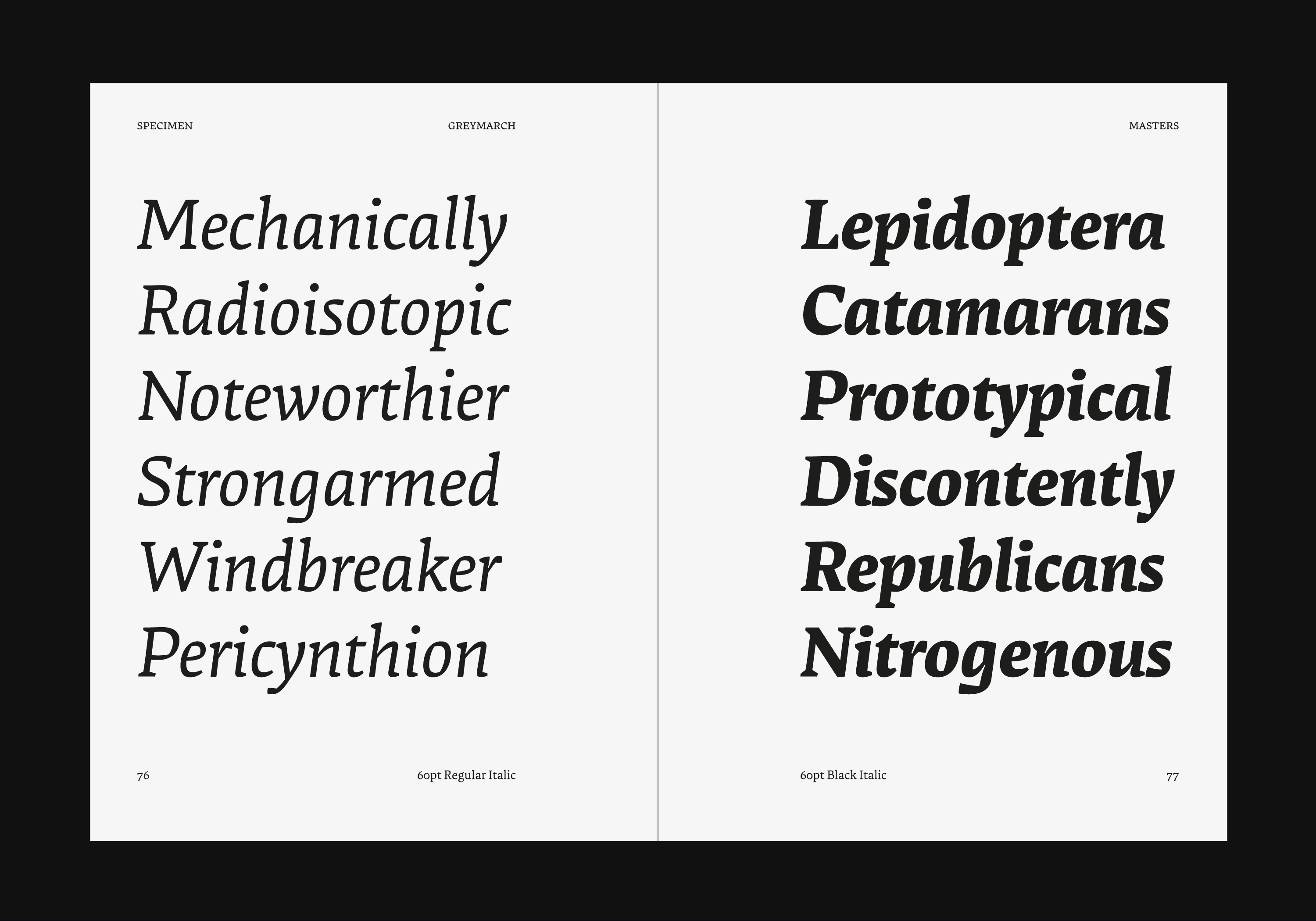
My graduation project for TypeMedia, Greymarch is a robust text serif in eight styles.
The typeface draws on a traditional humanist calligraphic model, while rationalising it with more contemporary proportions and shapes. The stroke of a broad-edged pen is apparent in the typeface, particularly the counters of round glyphs, but this is balanced by an outer contour which approaches mechanical symmetry.
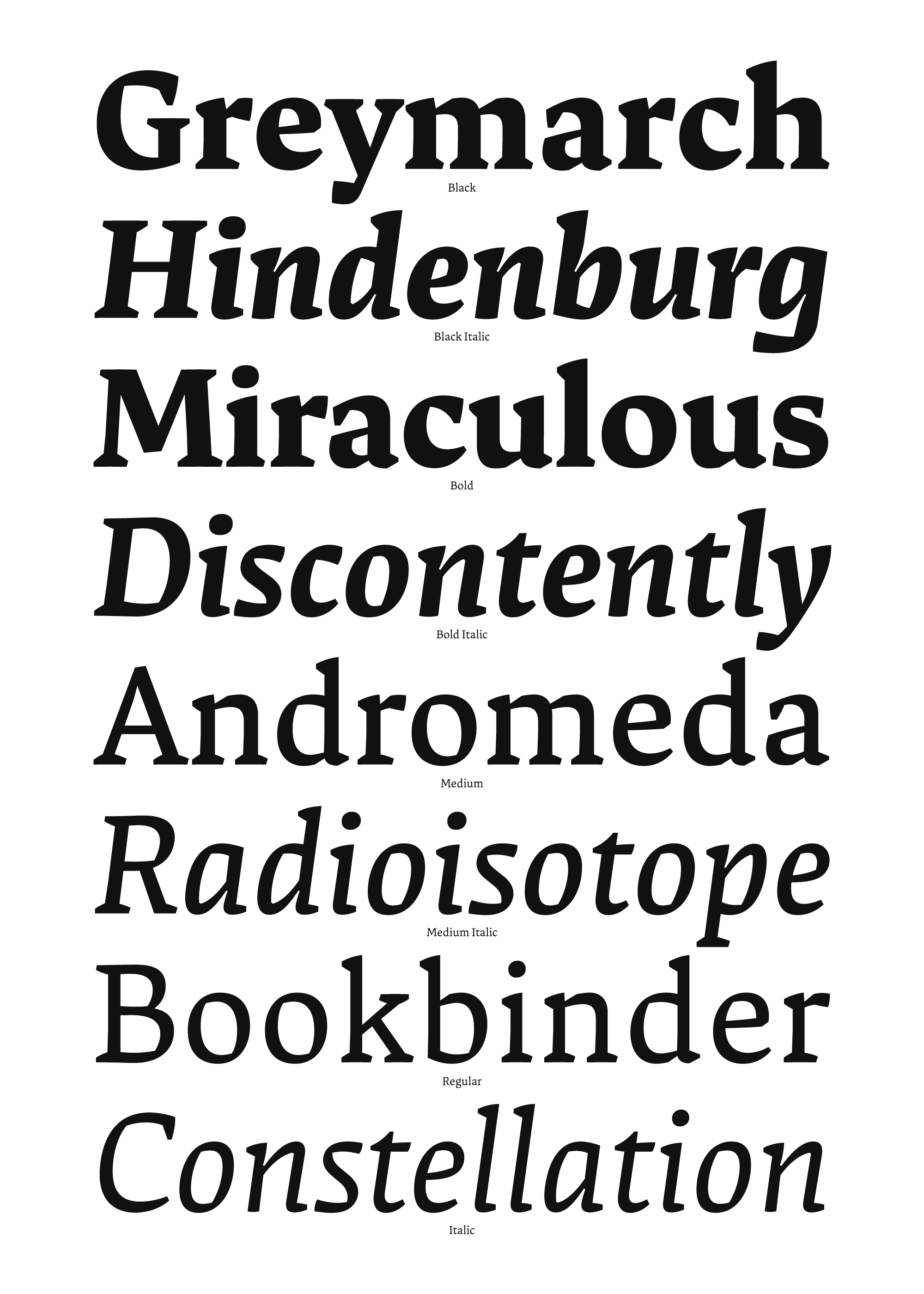
While the number of styles is fairly small, Greymarch's character set is decidedly larger. I concentrated on versatility in typesetting from early in the project, with manually-drawn (rather than automatically generated) small caps and a wide range of diacritics. The roman styles support 89 languages, with 470+ glyphs per master. Greymarch's vertical metrics were defined from the start to allow room for the generously-sized diacritics which keep the typeface legible at small sizes.
Spreads from the Greymarch process/specimen book:
Greymarch was created between February and July 2019.
With heartfelt thanks to my teachers at TypeMedia: Erik van Blokland, Peter Verheul, Paul van der Laan, Frank Grießhammer, Peter Biľak, Petr van Blokland, Françoise Berserik, Jan Willem Stas, Kristyan Sarkis, Ilya Ruderman, Just van Rossum and Fred Smeijers. Thanks also to my classmates, visiting lecturers, friends of the course, my mum, and everyone at Filtro Koffie.