A new look for an old friend.
Back in 2014, I applied for work experience with Vu Online, a local web design studio. What started as a week in the office quickly turned into a part-time job, and I worked as their Chief of Stuff for the next eighteen months — right up until I left for university. In 2016, I was happy to hear that they were planning to rebrand, and even more delighted when they asked me to collaborate with them on the project.
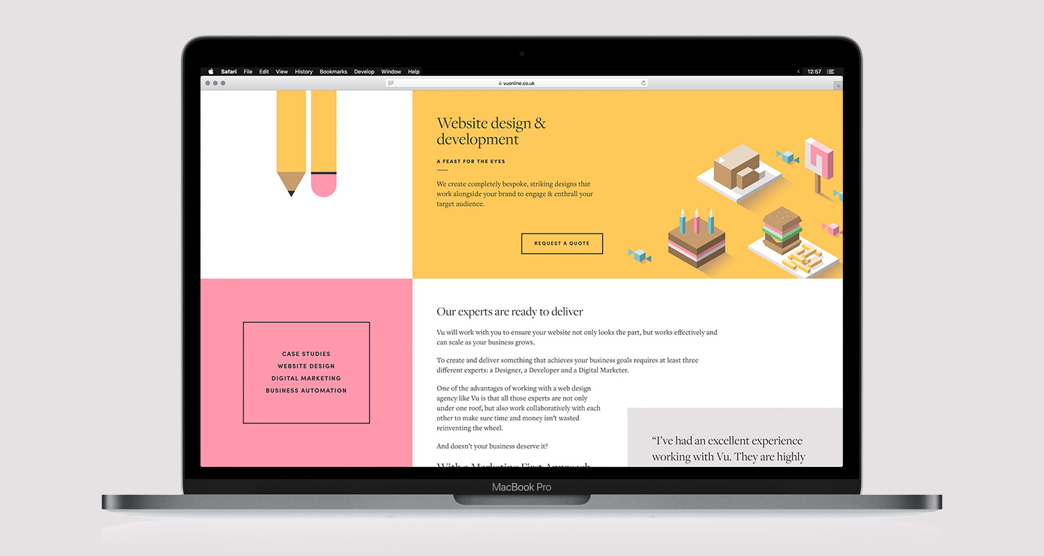
I worked closely with the team at Vu to determine the shortfalls of their former identity and establish what their actual target audience was, along with how a new identity could better appeal to it. The result was a much more playful, less masculine approach which features large blocks of colour, modern typography and subtly-animated isometric illustrations.
The logo is a geometric abstraction on Vu's name, intended to be versatile with regard to colour and size. I produced a series of playful alternate logos highlighting the different areas of Vu's practice, as SVG format to reduce load times on the website.

I also produced a number of illustrations for use around the website, both larger-format header designs and isometric icons to represent different services Vu offers. These are again implemented as SVGs on the web, which allows them to be subtly animated.

I collaborated with the Vu team on their business cards and other print materials. The website itself was built by Vu in-house (which makes sense, since they're a web design firm), but I worked closely with them to define the layout and type spec.
You can view the live website here.